Category Archives: Historicals

Historical and quasi-historical gaming of various sorts. English Civil War and Thirty Years War, the Great War (World War One), the Russian Civil War and other interwar conflicts, and whatever else we wander into!

A Naval Diversion

At BottosCon 2019 earlier in November I got the chance to play Warlord Games’ new Cruel Seas coastal naval game, British vs German speedboats in the Second World War. It’s not a bad game, but it’s definitely got some quirks and while the models are lovely, 1/300 (6mm) is too big for naval gaming. The table got very crowded very quickly and it felt more like bumper-boats than anything else.

That said, this sort of coastal gaming with light forces has always been one of the few areas of WW2 I’d consider gaming, so a quick chat with friends and look around the web pointed me to Last Square’s 1/1200 coastal forces, the Figurehead range, and I ordered a few British motor boats, some German boats, a few merchantmen, and a couple of aircraft. I also had a look at Magister Militum’s 1/1200 Hallmark range but decided to stick with Last Square for now.

I was also already aware of Brigade Models’ Small Scenery range, which has intrigued me for several years but which I’ve had no particular use for until now. You can, of course, run a perfectly good and realistic naval game with nothing but ship models and a blue or grey mat, but did anyone really think I was going to start a new genre and scale without doing some sort of scenery?

All of that stuff is enroute to me now and I’ll update when it arrives!

Rules?

Boats, ships, and scenery notwithstanding, what about rules? I’ll be trying out both the brand-new Narrow Seas by David Manley or Coastal Patrol by James Schmidt, published by TooFatLardies in their Summer 2011 Special.

We’ll try out both sets, as well possibly Flaklighter II from PT Dockyard, and see what works for us.

Other Resources

In the course of looking up the North Sea and English Channel battleground, I discovered that the amazing David Rumsey Map Collection has England and Wales, Sheets 1 – 146. Ordnance Survey, Popular Edition One-Inch to the Mile digitally composited at crazy high resolution so you can zoom way in and see what the land side of England and Wales looked like between the Wars. Not much in the way of maritime details like shoals and reefs, but fantastic for getting a feel of what the shoreline might have looked like, especially when you can compare the 1923 map with modern Google Maps/Streetview images.

Also from David Rumsey is a 1922 atlas showing the southern North Sea and English Channel with a bit more maritime detail like shoals, sandbanks, and shipping routes.

If anyone knows of a set of pre-WW2 Admirality charts online that cover England and maybe further, please do point them out. The National Library of Scotland has charts but they only cover Scotland.

The Wildfire III website has a scan of a maritime chart of the Thames Estuary and approaches with Allied & Axis ship losses marked, giving you a startling indicator of the intensity of the fighting, a lot of it shockingly close to shore. Lots of other good stuff there about WW2 on the Thames Estuary, too.

Finally, on a more directly related to the tabletop note, Mel the Terrain Tutor did some terrain for Cruel Seas when it first came out. Obviously the scale will be different from what I’m planning, but sandbanks and such are pretty scale-agnostic anyway… By way of an end to this long and rambling post, here’s Mel’s rather good tutorial video on sandbanks for small scale naval games.

Fenris Games Runestones

I picked up a few things from Fenris Games back in June or July, and the first pieces are finally getting completed and onto the gaming table!

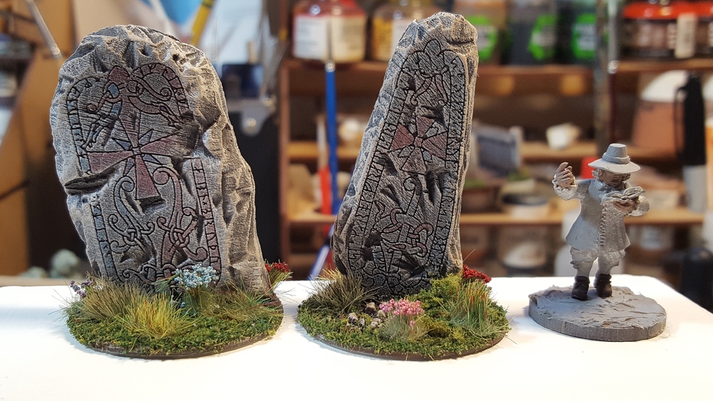
runestones, front.
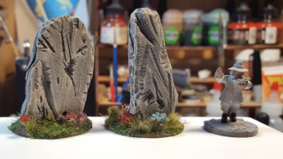
Two Viking Runestones from Fenris Games. Click for larger.
These are “Viking Runestones 2” from Fenris, cast in pale grey resin. Each is about 2″ tall. The carved runes on the front are very finely detailed; I wouldn’t be surprised if they had been laser engraved on something (thin acrylic?) and that was then embedded in putty or something to make up the rest of the stone.

runestones, back
Runestones, rear view. 28mm Warlord ECW figure for scale. Click for larger.

I’ve got a few other bits and pieces from Fenris in progress. All of their stuff is really high quality, their range is huge, and shipping was fast. Highly recommended!

A 17th Century Bastion, Part One

Several of the scenarios in Pikeman’s Lament ask for a bastion or earthwork to be attacked or defended, but at a maximum area of 9″x9″ it isn’t going to be some grand fortification or anything.

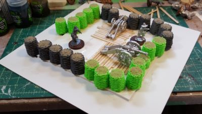
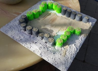
I wasn’t sure what, exactly, could be done in that area, so I cut a piece of heavy plasticard that size and started arranging my Assault Group guns and crews around the 3d printed gabions we found over on Thingiverse.

The 3d Printed Gabions

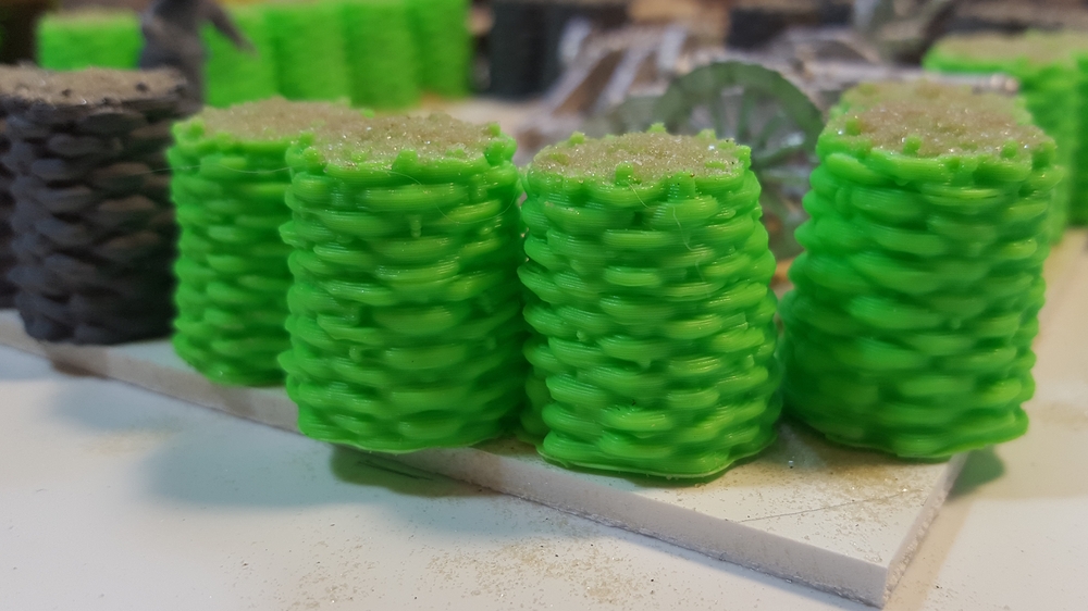
As seen previously here on The Warbard, my brother Corey owns a 3d printer. A Creality Ender 2, apparently. Gabions are big roughly-made wicker tubes filled with dirt, basically, used for temporary fortification for centuries – right up until at least the First World War, in fact. They’re iconic looking but would be really, really fiddly to scratchbuild. Finding the set of 3d modelled gabions for free over on Thingiverse was what kicked this whole project off.

3d printed gabions in closeup. The striations of the 3d print process nicely add texture. Click for larger.

If you haven’t got access to a 3d printer, Renedra will sell you a couple of sprues of quite nice-looking gabions for a very reasonable sum.

The Bastion

The 9″x9″ footprint was dictated by the Pikeman’s Lament rules, but proved to be a good size anyway for a bastion that could hold one gun with crew or a full unit of 12 infantry in the Pikeman’s system while not dominating the table. It’s still a very, very small bastion; even single-gun emplacements in the English Civil War were usually bigger than this once you included their surrounding ditches and such. Compromises are always made for tabletop usability, however!

The actual gabions and fortified part of this are raised slightly on a 6″x6″ offcut of 1/8th” EPVC plastic board, with openings for cannon to fire through on two sides and a ramp leading down and out on the third side.

Gabions in lace and planking started inside. Assault Group guns and crew and a Warlord plastic infantry figure for scale. Click for larger.

I used chunks of styrofoam to fill in the area outside the gabions, sloping up slightly from ground level, holding it in place with hot glue to speed up construction.

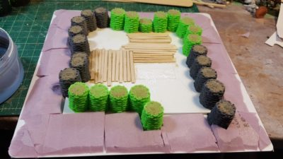
Styrofoam to fill in the slight slope up to the outer edge of the bastion itself. Click for larger.

To cover the styrofoam I mixed up premixed plaster, white glue, sand, and a bit of water to make a tough textured fill, then pushed it into place with a tongue depressor. The interior has flooring/duckboards made from wooden coffee stir sticks, with sand filling the gaps between the boards.

Plaster, white glue, and fine gravel over the styrofoam. Click for larger.

Paint tomorrow after the plaster has had a chance to dry fully. I thought about putting extra obstacles in the ground outside the gabions, but have decided to leave it mostly bare earth. I do have my recently-bought Renedra chevaux-de-frise to add around the bastion once it’s on the table, after all.

A Graveyard (Much Delayed)

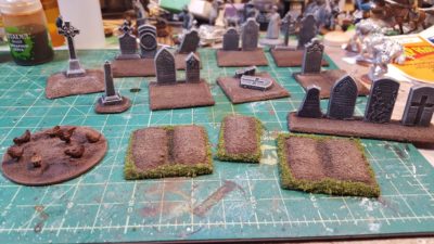
File this one under “long neglected projects finally finished”, I guess. I’ve finally based, painted, and finished the last of the Renedra gravestones I started way back in February 2013, which were actually purchased in December 2012.

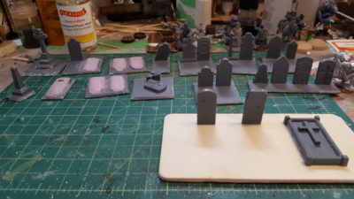
Back in 2013 half of them (one of the two identical sprues) got cleaned up, based, sand added to the bases, and grey primed, and that was it. For more than five years.

graves13Feb13
The original 2013 batch of graves, based but not yet primed. Click for slightly larger.

In early 2018 I pulled the 2013 bits out of storage and got them painted up and flocked fairly quickly for the game I ran at Trumpeter Salute 2018.

The paintjob was pretty simple. I hit all of them with a wash (GW Nuln Oil or Earthshade), then drybrushed and scrubbed various other colours across the stones. Two different shades of grey, some dark green, two shades of tan, and two shades of off-white applied in different amounts to different stones give a bit of variation to each stone.
Finally, this week I’ve pulled the second sprue out and got them all based up.

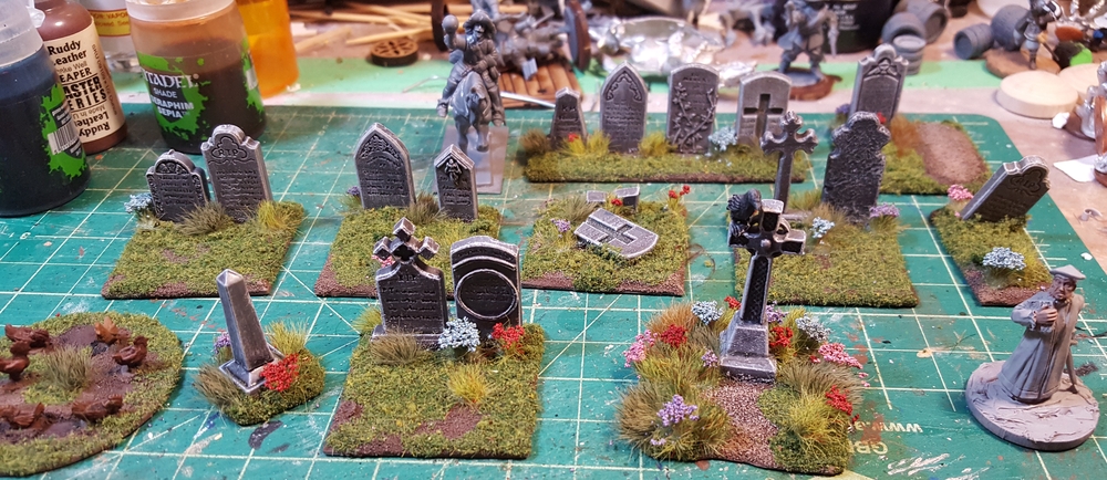
Latest graveyard stuff all based up. Click for larger.

The bases are all leftovers from various Warlord ECW plastic box sets. I think the newer stuff is from the Firelock Infantry box and the older from either the regular infantry or cavalry box. Waste not, want not, and I wasn’t ever going to use them for figures! The freshly dug graves (great potential plot points!) are just scrap styrofoam glued down and then sanded.
Latest graveyard bits. Fresh graves in front, regular gravestones behind. On the left is a base of chickens from Warbases, just for fun. Click for larger.

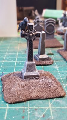
I’ve used the Celtic cross and some of the base pedestal bits to create a roadside cross or shrine. Just the thing to lurk on a dark and misty moor or something!

The roadside cross, still in progress. Complete with ominous raven! Click, as usual, for larger.

Finally, I used Rain City Hobbies tufts and flowers to add some detail and interest over my usual mix of flock. I really like the little pops of colour the flowers provide, and they’re becoming a standard feature on my scenery, especially the English Civil War items.

Finished, all these years later! I’ll get some photos of the full graveyard setup soon. Click for larger.

Should you want your own gravestones the two-sprue set is still available from Renedra which is definitely not always the case when coming back to some products after this long. Hopefully you take less than seven years to get yours ready for the tabletop!

Stable Genius

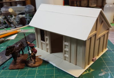
After finishing the three little cottages on Saturday, I decided to do something slightly different on Sunday and made a building that could serve as a stable or other outbuilding for a manor farm on my ECW/English pulp tables.

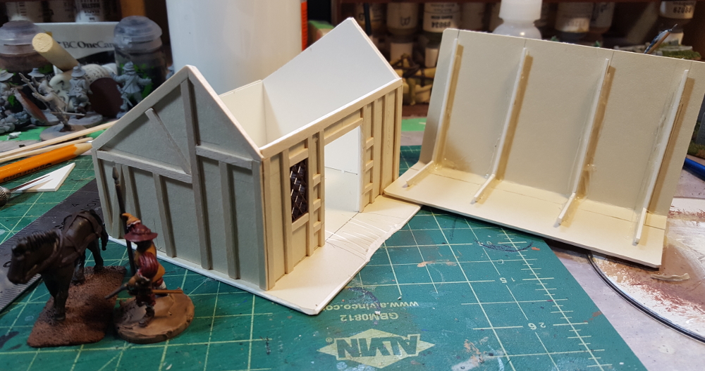
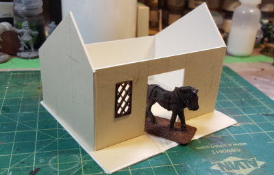
It’s 3″ deep and 4″ wide, so actually larger in footprint than the little hovels. Horse need their space, tenant farmers not so much! Same construction, 1/16th mattboard (picture framing card) with wooden coffee stir sticks for the timbering. The roof is assymetric, with the peak closer to the front of the building instead of down the centreline, for no other reason than it looked more interesting and on a gaming table, people spend a lot of time looking down at rooftops!

Stable “blank” assembled, with window and horse both from Warbases. Click for larger.

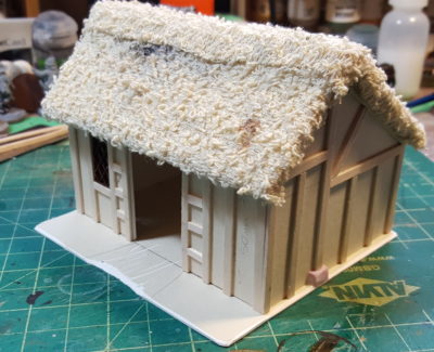
A roof with a pitch like this should probably be shakes or slate or something, because a steep pitch is part of what helps keep a thatch roof watertight, but towel thatch is a heck of a lot faster to assemble than a shingled roof, even with Warbases’ nifty lasercut tile cards available! Perhaps I’ll go back and rebuild this roof with tile card in the future, when I’m not under a pre-convention time crunch… but don’t hold your breath!

All the half-timbering complete and unthatched roof in place. Click for larger.
Roof off, showing the card “beams” to give it some strength. Click for larger.
Towel thatch in place, including an extra strip across the top ridge. Paint to follow! Click for larger.

I’ll add open doors on the big doorway on the front; the doors are built but not installed yet. I might whip up a couple of horse stall walls to put in the interior, but honestly that seems like a post-Trumpeter addition to me…

BSC 2018: Correcting some too thin errors

As I am fairly new to 3D printing, I am learning a tonne about what not to do. One of the biggest issues I have discovered is that things that look good in CAD can look absolutely terrible once printed, given the resolution of the printing or the limitations of FDM 3D printing. Today I wanted to talk about three different, but similar errors I made: making a part too thin to print correctly.

Back corner of the cab

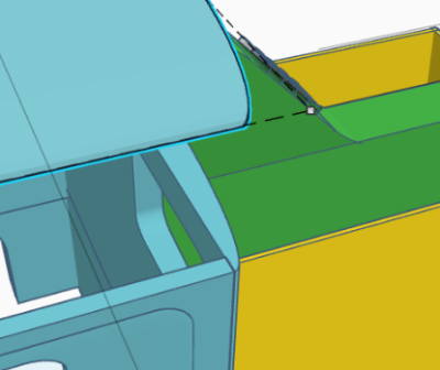
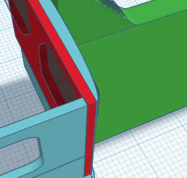
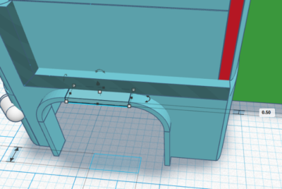
First up – the back corner of the cab. As the backside of the cab is curved, it thins quite a bit at the very back corners.

Back corner of cab in blue. See the thin joint at the very end

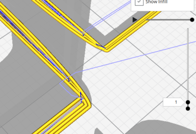
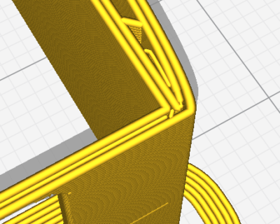
When you bring this into Cura to slice it for printing, the problem becomes obvious.

Back corner of the cab, showig that when printed, it will only be two layers thick (~0.8mm)

The solution to this is to thicken the back wall of the cab, which I did by adding a flat piece to it:

Back corner corrected with additional piece (in red)

Once you bring that into Cura, you see that the narrowest part is now at least 1mm thick, so the piece shouldn’t be so weak.

Thicker corner sliced in Cura

Fenders

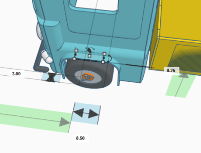
The next piece I tackled was the fenders. They were originally 0.25mm thick, which means that they were just over one layer thick when printed at 0.2mm and only two layers thick at 0.1mm. This meant they basically didn’t print at all.

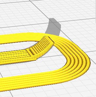
Fender dimensions

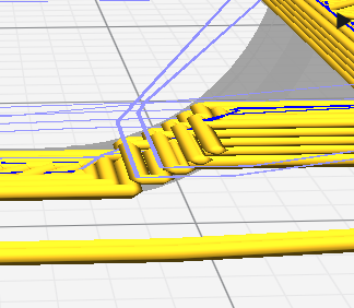
Fender sliced, showing no overlap

The solution to this problem is two-fold: thicken the fender up to 0.5mm and also only print at 0.1mm (considered Fine quality).

New fender, now 100% thicker!

New sliced fender, showing overlap

Top of the windshield

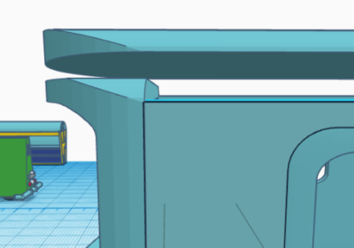
This is actually entirely my error. I made the windscreen and frame around it taller than the sides or back of the cab. This meant when I cut up the model to slice, the top of the windscreen disappeared. Oops.


Top of the windscreen, showing the height difference


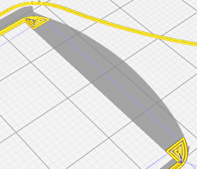
Top of the cab when sliced. That grey area is supposed to have yellow lines for printing

BSC 2018: First print of 1956 PANG

The new printer board for my 3D printer finally showed up, so I got to printing the first print of my 1956 PANG. It was less than a full success. As you can see in the pictures below, I have a bunch of work to do.

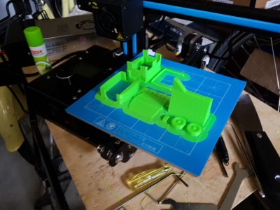
Printed truck on build plate. Printed without the side compartments. Excuse my messy garage

As can be seen on the build plate, a bunch of details didn’t come out right – the biggest of which was the top of the cab for some reason completely failed to print correctly. I also accidentally selected brim intead of skirt, so I had lots of cleanign to do.

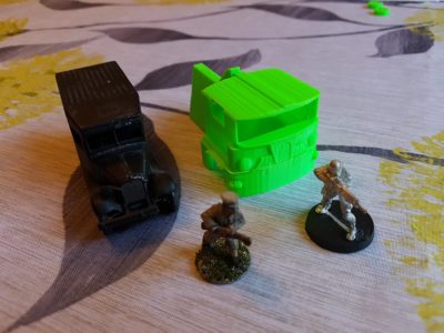
Front & side view. Lledo Model A, Copplestone Chinese and Infinity Ariadna for scale

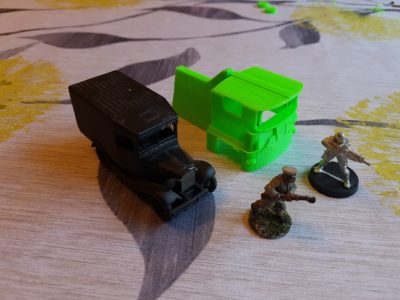
The sides of the truck aren’t very smooth, and a bunch of the finer details simply didn’t print.

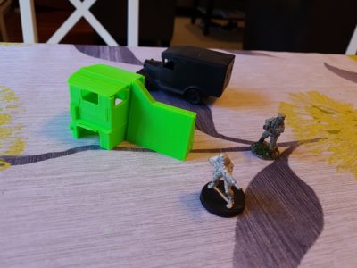
Side rear view of the truck
Side rear view of the truck with Lledo Model A, Infinity Ariadna and Copplestone Chinese for scale

Front and side view of the truck

So what next? First of all,my printer needs some upgrades:

  • A part cooling fan (the Ender 2 lacks it by default)
  • Belt tighteners (and the belts replaced with metal-core of some kind)
  • A more modern Marlin (the firmware that runs the printer)
  • A lot more tuning

On the truck, the first thing I am going to do is shrink it by 25 to 30%. It is too large for what I want. Then I need to some work on the model itself

  • Thicken some of the walls so that they print, especially the fenders, which didn’t print at all
  • Clean up some of the smaller details, possibly removing them for now
  • Re-cut up the cab so it prints correctly

Anyway, I have my work cut out for me!

BSC 2018: PANG print layout

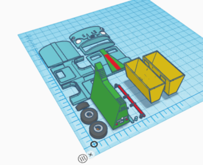
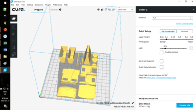
I finally got around to laying out the 1956 PANG for the first printing. As you can see from the pictures below, I am trying to remove the need for supports which will mark the surface of the final print.

Final draft for reference

Laid out in TinkerCAD for printing

I chose not to break out the rear section or the bins for initial printing. I likely will in the final version, as it will speed up print time and make it cleaner.

Cura print layout
Cura layout, with approx. print time. Note that my printer (Ender 2) has a fairly small print bed, so this will fit on it


One final note: I am certain that there will be tweaks needs to be this and I am missing things, namely an interior and side mirrors to start.

BSC 2018: 1956 PANG first printable draft

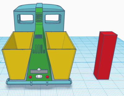
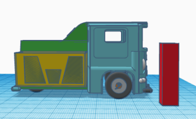
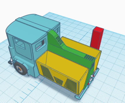
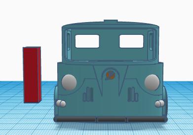
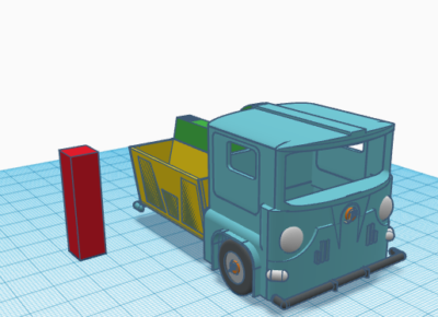
Build Something 2018 continues and I have been pretty quiet for the last week. Part of this is because I am waiting on the warrantied printer board, so motivation is low. Also been busy with other things. But today I kicked myself into gear and go the first printable draft done of the 1956 PANG. Take a look below (the red rectangle is 32mm high and is there for reference):

Front view of 1956 PANG truck
Front View

Front angled view of 1956 PANG
Front angled view

Rear view of the 1956 PANG

Side view of the 1956 PANG

Rear angled view of the 1956 PANG


Colourful Cavalry, Part Two

Horses in colours other than brown!

Armour in colours other than silver!

Dogs and cats living together! Chaos and disorder!

Well, something like that. Horses and armour, at least.

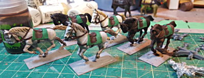
I realized that all twelve horses for my regular ECW cavalry are all brown. Every last one of them. There’s a bunch of variation in tone, mane colour, stuff like that, but they’re all bay, which is horse-speak for brown. Well, some of them might be chestnut, which is horse-speak for “lighter reddish brown”, more or less. For the six horses I needed for the current batch of cuirassier I decided to mix it up a lot. There’s a white horse, two different shades of grey, two different bay, and one black horse.

All six cuirassier horse. Hair, mane, and tail all done. Hooves, tack, and some details still to do. Click for larger.

Unfortunately I totally forgot to write down any of the paint mixes or layers I used for this batch of painting, so I’ll have to re-invent the wheel, or at least the horse paint, next time I do horses!

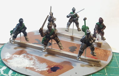
For the armour, I put pins up into the backsides of all six cuirassier, making them extra-long to make painting easier. Then I used a scrap CD, two lengths of scrap wood, and my hot glue gun to create a very useful little painting stand, seen in the photo below.

All six riders got all their armour basecoated bright silver (Reaper’s True Silver), then various inks and washes were layered over to try for a treated-metal appearance as discussed in my last post on coloured armour.

GW’s washes don’t work as a base layer for this, I discovered right away. They’re not designed to stay on flat surfaces particularly well, although they shade crevices and lower areas of a surface very nicely. I used India ink for the three blacked armour sets, Reaper’s Red Ink for the russeted armour, and FW Artist’s Acrylic Inks for most of the rest of the colour.

The three blacked armour riders were basically done after one coat of thinned India ink, and then I went back in with metallic paint to do some of the edges and highlights, especially on the rider in the foreground of the photo with the hammer and plume.

Armoured riders. Front right blacked with silver edging, rightmost russet, two background guys both blacked, blued armour on the far left, then the second russet armour guy foreground centre. Click for larger.

The two russetted armour guys and the one blued rider (far left) got at least a couple of more layers, including either very, very thin India ink or GW’s Nuln Oil to darken the bright initial ink coat. The blue guy especially looked incredibly bright and weird after his first coat of just blue ink – my girlfriend saw him and said, “Seventeenth Century Power Ranger!” and damned if she wasn’t right…

I’ve also discovered that these guys are nearly impossible to get a decent photo of in their current setup, the above blown out and fairly crap photo is less crap than all the rest. I’ll try for better pictures once the riders and horses are all attached to each other. Still to do is boots, saddles, faces, and weapons.

I’m really pleased with how these guys are turning out so far, and I think they’ll look great on the tabletop once they’re all finished. Ink over silver is definitely a win for doing coloured armour!