All posts by The Editors

We Are The Editors.

Paint It Black

This is a wargaming website run by a pair of Canadians. It’s hosted on a Canadian server (a very deliberate decision, I should point out). So why is this post about American politics?

Because SOPA (the Stop Online Piracy Act) and it’s evil twin PIPA (the Protect IP Act) currently being debated by American legislators are so mind-bogglingly stupid, badly thought out and vile, frankly.

And because, especially under our current Conservative government up here, Canada has a bad habit of following our giant southern neighbour happily over whatever stupid policy cliff it’s just launched itself. SOPA/PIPA is a really, really big cliff. One that could wind up with the wreckage of much of the Internet as we know it splattered at the base of it.

Michael Giest has a great article on Why Canadians Should Participate in the SOPA/PIPA Protest. Read it before he blacks out his site.

I also know from the site stats we keep here that significant number of our visitors are American. Unlike those of us from overseas, who just have to watch in horrified astonishment and make what protests we can, our American visitors have Senate and Congressional Representatives they can, and should, be contacting to hammer home just what bad laws SOPA/PIPA are.

Wikipedia is going black. So are WordPress.org, BoingBoing, Reddit and a host of tech and geeky sites. Closer to wargaming, TGN and parent site CMON are going black.

We”ll be blacking out Warbard in solidarity from 0800-2000 PST Wednesday the 18th.

We’ll be back that evening, and so will all those much, much larger sites I mentioned above. But if SOPA/PIPA are rammed through, huge swathes of the Internet as we presently know it could wind up black for good, wrecked by bad laws passed by idiots.

Pulp Design Tools & Resources, Part Three: Inspiration

Infection Is Avoided...
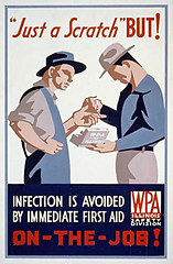
A 1930s WPA job-safety poster. Via x-ray_delta_one on Flickr.

A necessarily brief, personal and idiosyncratic tour through some websites with noteworthy archives of 1920s/30s posters, postcards, luggage tags and other graphics. Some photos, some stuff that’s technically outside our chosen era but still cool, and far too short, but enjoy, be inspired, and get a feel for the graphics of the pulp era!

Part One of this series introduced Inkscape. Part Two talked about design, typography & fonts.

The American Library of Congress WPA Posters collection, part of their American Memory project, is huge but not that easy to navigate. Start with the Collection Highlights tour, then just start hitting random keywords or subjects to find gems like Yellowstone Park posters, injunctions to clean up your trash, and even hippos. The WPA was the Works Progress Administration, part of the whole New Deal aimed at keeping Americans employed and maintaining national morale during the Great Depression. There was a whole wing of the WPA dedicated to encouraging the arts, including the graphic arts. Hence the really cool posters.
Continue reading Pulp Design Tools & Resources, Part Three: Inspiration

Pulp Design Tools & Resources, Part Two: Fonts

This is the second in a series of posts (three or more) aimed at introducing gamers to some of the resources out there they might not be aware of for making their own graphics & such. It’s based on our current areas of interest, the 1920s & 30s interwar pulp period, but should be of interest to anyone wanting to add some graphic design details to their gaming!

Part One was a general introduction to Inkscape.
Part Three is on online sources of pulp/interwar design & other images.

A Quick Intro to Some Pulp Design Basics

van isl golf poster
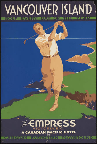
A 1930s Canadian Pacific poster for the Empress Hotel. Via Boston Public Library's Flickr account (CC BY-NC).

Have a look at the image to the right; it’s a good basic distillation of the design principles shared by many of the 20s/30s graphics we’re trying to replicate for our own uses. There were, of course, a number of different styles and variants in use in the period, this one just happens to be a favourite of mine and also easy to replicate in Inkscape!

There’s no gradients, just areas of solid colour. Shading is done with smaller areas of another solid colour — see the area along the golfer’s inner thigh or around his arms — or not done at all. Notice that the grass and sea are simply solid colours; the sea and sky are even exactly the same shade of blue, with the horizon sketched in with a thin tan divider. No outlines or sketch lines, either, just areas of colour.
Continue reading Pulp Design Tools & Resources, Part Two: Fonts

Pulp Design Tools & Resources, Part One: Inkscape

Everytime Corey or I post player aids, faux-vintage ads, building signs, faux magazine covers or similar to forums or elsewhere, there’s always people curious about the tools, fonts and resources we use.

This is the first in a series of posts (probably at least three) aimed at introducing gamers to some of the resources out there they might not be aware of for making their own graphics & such.

Part Two on fonts, typography & design has been published now.

Inkscape

The main tool is Inkscape, an amazing Open Source vector-graphics editor. It’s free to download, available for Windows, Linux, or Mac, and quite possibly the coolest program ever.
Continue reading Pulp Design Tools & Resources, Part One: Inkscape