A necessarily brief, personal and idiosyncratic tour through some websites with noteworthy archives of 1920s/30s posters, postcards, luggage tags and other graphics. Some photos, some stuff that’s technically outside our chosen era but still cool, and far too short, but enjoy, be inspired, and get a feel for the graphics of the pulp era!
Part One of this series introduced Inkscape. Part Two talked about design, typography & fonts.
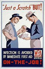
The American Library of Congress WPA Posters collection, part of their American Memory project, is huge but not that easy to navigate. Start with the Collection Highlights tour, then just start hitting random keywords or subjects to find gems like Yellowstone Park posters, injunctions to clean up your trash, and even hippos. The WPA was the Works Progress Administration, part of the whole New Deal aimed at keeping Americans employed and maintaining national morale during the Great Depression. There was a whole wing of the WPA dedicated to encouraging the arts, including the graphic arts. Hence the really cool posters.
There are also WPA posters all over the internet, including in a lot of the collections down this page. One bonus thing about them is that because they’re U.S. Government-produced, there’s no copyright on them. They can be reproduced by anyone, anywhere. Getting them through the Library of Congress website does ensure you get full-sized high quality images, though.
Vintage Poster – text in French, but who cares when you’re there for the visuals? All sorts of great stuff from all over the world and a number of languages, not just 20s/30s but ranging from the mid-19th C up to the 1970s or so. A random selection from favourites: Syrie-Liban, Brissago, Maroc, Splash! and Autriche.

Flickr has a lot of excellent stuff tucked away amongst the vacation photos, kittens and bokkeh. X-Ray Delta One (an excellent pulpish nick!) has lots of good stuff; especially in his Best of Pulp & ’30s and the WPA sets. Paul Malon posts mostly advertising material from the 20s through to the 50s, all worth checking out. His Pulp Fiction set is mostly superscience sillyiness from Popular Mechanics & similar magazines, and there’s lots of other good stuff too.
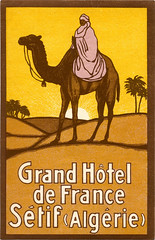
Luggage labels, hotel stickers and similar smaller items are an awesome source of inspiration, and a great idea for a small intro project in Inkscape. Art of the Luggage Label and Luggage Labels by b-effe are well worth checking out.

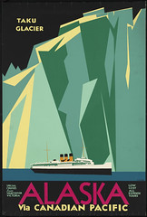
Last but definitely not least, Boston Public Library have a huge collection of stuff on their Flickr account. Most immediately of interest are probably the Travel Posters and Produce Crate Label sets. The Canadian Pacific Vancouver Island golf poster we used back in Part Two of this series was from the BPL’s Flickr collection.
Wikipedia, and it’s sister-project Wikimedia, are very valuable sources, especially if you want flags, naval ensigns, coats of arms and similar. They’ve got a good selection of historical and extinct flags, too. Need the 1920s-current Soviet Union flag? Wikipedia has one. They’ve got the Russian Imperial Standard, too. Most of the Wikimedia images are available in SVG, which is perfect for Inkscape users!
Finally, we should repeat a link from a previous post in this series, to the Open Clipart Library (OCAL). A great resource for all sorts of small graphics, from flags to scorpions to another hippo. All Public Domain, and all available in SVG for easy use in Inkscape! I use OCAL graphics a lot for spot art in Encounter Cards for scenarios.
So browse the great pulp-era art out there, get inspired, and design your own stuff!
Part Four of this series, on copyright, licenses, Creative Commons and related matters (and why they matter to creative gamers!) will be coming soon!

One thought on “Pulp Design Tools & Resources, Part Three: Inspiration”