This is the second in a series of posts (three or more) aimed at introducing gamers to some of the resources out there they might not be aware of for making their own graphics & such. It’s based on our current areas of interest, the 1920s & 30s interwar pulp period, but should be of interest to anyone wanting to add some graphic design details to their gaming!
Part One was a general introduction to Inkscape.
Part Three is on online sources of pulp/interwar design & other images.
A Quick Intro to Some Pulp Design Basics

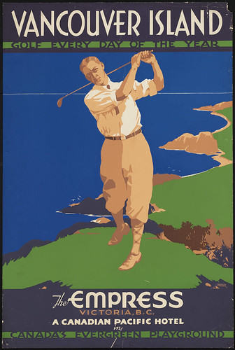
Have a look at the image to the right; it’s a good basic distillation of the design principles shared by many of the 20s/30s graphics we’re trying to replicate for our own uses. There were, of course, a number of different styles and variants in use in the period, this one just happens to be a favourite of mine and also easy to replicate in Inkscape!
There’s no gradients, just areas of solid colour. Shading is done with smaller areas of another solid colour — see the area along the golfer’s inner thigh or around his arms — or not done at all. Notice that the grass and sea are simply solid colours; the sea and sky are even exactly the same shade of blue, with the horizon sketched in with a thin tan divider. No outlines or sketch lines, either, just areas of colour.
The typography and fonts are varied but repeated, usually just one font per line (the exception here is “The Empress” with the swash script “the”). Reversed text – the two green lines with dark text in them – is used for emphasis. The text colours are solid, no gradients here either, and repeat the colours found in the graphic. There’s really only about six colours used in this entire poster.
The alignment on this one is straightforward too, almost everything is centre-justified, from the golfer to the top and bottom text. There’s a more subtle box around the three lines of text below the golfer, though — notice that the left and right edges of “The Empress/Victoria, B.C./A Canadian Pacific Hotel” all align. At the top “Vancouver Island/Golf Every Day of the Year” also have their outer edges aligned. Careful letterspacing (hand kerning) can achieve this effect easily in Inkscape.
Period Fonts
So, we have some idea how text was used… where to find suitable fonts for use in Inkscape?
There are lots and lots of free font sites out there. One of the very best is Dafont, which is well organized, easily searchable, and maintains links back to the font creator’s own websites — useful for finding fonts that haven’t been added to Dafont yet, as well as showing that Dafont isn’t trying to rip these fonts off and claim them for themselves. There are several categories of interest to us, especially Fancy > Retro & Typewriter
ZPi Fonts gets his font inspiration right from classic posters and documents of the era (including a lot of the classic WPA posters). They look authentic to period because they are authentic to period! You’ll see a lot of ZPi Fonts in the original work on this site.
The H.P. Lovecraft Historical Society do a lot of cool stuff, including their HPLHS Prop Fonts, a number of which are free to download; the rest will cost you $20 or so for a CD-ROM full of great reproductions of period fonts.
The League of Movable Type — not as outright pulpy as some of the other sources, but some very nice re-creations of fonts that would have been in use in the pulp era. I especially like Goudy Bookletter 1911 & Sorts Mills Goudy for body text. Not showy fonts, but very nicely done for a great price — free.
We might do a supplemental post at some point listing favourite specific fonts from sites like Dafont, but this is long enough already! Start with the Zapatopi & HLPHS fonts, then have a look through Dafont & elsewhere to find fonts that work well with that starting set.
Got another source of period fonts you like, or any other comment? Please leave feedback below, always great to hear from readers.

The poster is a lithograph. The printing technique is similar to silk screening – basically a separate printing for each color. Leaving off black outlines cuts the printing costs by about 15% in this case.